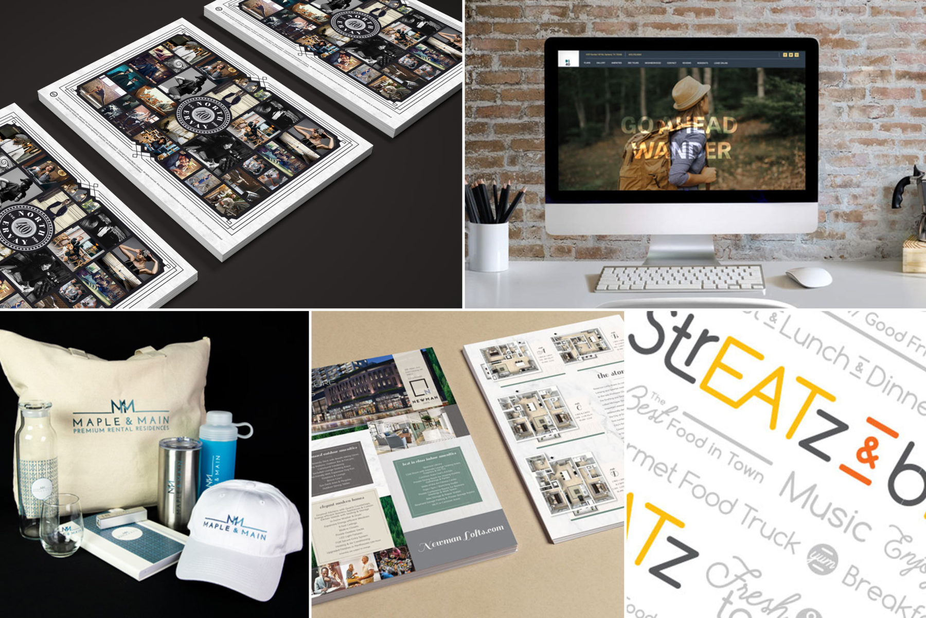
Our Favorites from 2018
Our team put in plenty of hard work over the last 12 months, so, in honor of the new year, we’re excited to showcase a few creations that we genuinely love. Sure, it’s hard to pick favorites when we work with fascinating brands each day, but that’s a pleasant challenge to face.
Here at MMC, we truly enjoyed working with our clients to craft these solutions. Let us share a small selection of our 2018 adventures with you.
400 north ervay branding
BRAND CHALLENGES
400 North Ervay is a uniquely storied apartment community in downtown Dallas, boasting a famous history as a 1930’s courthouse. Their brand needed a strong story to capture a nostalgic feel, without overshadowing the high-end living style.
The look had to capture the fantasy without looking cheesy or over-the-top. The older building needed to feel charming, but not stale. With renovations still on the horizon, our photographer faced the challenge of working without the new furniture.
BRAND SOLUTIONS
Our team embraced history with a low-light, speakeasy feel. We create a mood board with inspiration for the interior designers to create a truly cohesive look when paired with the brand. Faded colors and vintage touches set the tone while timeless, upscale lifestyle images connect to the modern features.
Close-ups, bold angles, and mood shots capture the amazing building, while not being too focused on the older decor. Combining a wide range of services including copywriting, photography, design elements, and collateral, we set up a holistic story that feels truly complete, controlled, and confident.
WHY IT’S A FAVORITE
More than just apartments, this community’s charming, luxury lifestyle gives residents something to brag about. There are few brands with such a strong and interesting story behind them.
The complexity of the challenges and variety of approaches gave us a chance to develop something extremely thorough and unique.


domain at the one forty website
BRAND CHALLENGES
Domain at the One Forty is an apartment community in a very competitive DFW neighborhood. However, no one else has their 140 acres of green space, 20 of which is beautiful, undisturbed wilderness. These residences were a step above the rest, and from the beginning, we knew this would be “not your average website.”
Most importantly, users needed a full, emotional understanding of the experience. We needed to create something immersive that captured the feeling of stepping onto the property through 360 tours, messaging, and imagery combined.
In a competitive landscape, this site had to stand out.
BRAND SOLUTIONS
We combined the typical gallery and amenity pages into one strong page. Large photos with clear labels create an instant visceral impact and allow viewers to absorb content quickly.
Messaging focuses on what makes Domain different. The outdoors is a certainly the main theme. 360 tours also take prominence, offering a unique chance for curious digital visitors to experience the spaces. The right information is shown at the right time, guiding a user through their journey.
The unusual layouts of the site incorporate compelling parallax movement, connecting with the fun and adventurous photography. Modern, clean design makes for easy mobile usage and strong UX.
WHY IT’S A FAVORITE
Different is always much more interesting. We love the unique nature and adventurous qualities that make the Domain at the One Forty website special. It was certainly a lot of fun to make, and it gives users an unforgettable experience.


streatz & beatz LISD food truck
BRAND CHALLENGES
This Lewisville ISD owned food truck serves free meals to children experiencing hunger. The genius idea to create a truck that anyone could (and would want to) buy from eliminates stigma for these kids. To handle this effectively, we needed a brand that it right in with trendy food truck culture, appealing to all young adults.
The menu is rotating with different style foods for breakfast, lunch, and dinner changing weekly. With such a wide selection, branding would have to work for any cuisine.
But before it could hit the streets, this truck needed a name.
BRAND SOLUTIONS
We played with a lot of ideas, but the name Streatz & Beatz won out, combining 3 aspects of the service. The streets it visits, the eats, and the musical beats. The truck would play hot songs as part of its trendy image.
Bright colors and modern styles target the elementary to teenage demographic well. Clean and simple, the branding feels as trendy as any food truck. We avoided any specific food imagery and opted instead for a typographical motif that keeps the look vibrant. Flexible and attention-getting, the design works for any week’s menu.
WHY IT’S A FAVORITE
More than just apartments, this community’s charming, luxury lifestyle gives residents something to brag about. There are few brands with such a strong and interesting story behind them.
The complexity of the challenges and variety of approaches gave us a chance to develop something extremely thorough and unique.


newman lofts branding
BRAND CHALLENGES
This sophisticated apartment community is located near Michigan State University, targeting age 55+ alumni and college professors.
Built right alongside a student living community and in a walkable neighborhood full of shops and excitements, Newman Lofts defies any senior living stereotypes. MMC needed to carefully target this very specific demographic: urban, astute, and dynamic.
Starting with great building blocks for their brand, we had a chance to expand it into a full story, capturing this highly niche product.
BRAND SOLUTIONS
Photography became key. Using a limited source for stock, we were able to finesse out images that reflected the interior design, attitudes, and personality needed to paint a complete picture. Warm tones and deep contrasts add refinement and consistency.
In the graphics, we used the natural color of local forests, which mimicked Michigan State green. A tree pattern added a natural element, a touch nicely complementing the very sleek, flat look of the modern interior design reflected in other graphical elements.
Colors are muted, but fascinating. There is no bustle or stress. The sense is one of relaxed luxury, with an undertone of comfortable excitement.
WHY IT’S A FAVORITE
The unique, multi-purpose property and challenge of marketing to a very specific demographic provided an excellent opportunity to challenge our team with something new. We were able to show that senior living can be modern, urban, fun, and full of excitement.


maple and main promotional merchandise
BRAND CHALLENGES
Maple and Main is and impressively high-end apartment community that came to MMC for superior resident gift sets to hand out at several occasions. To meet the tastes of their clientele, the products had to be memorable and befitting the exceptional style of the building.
The sets would need to be themed and designed to be appropriate to the occasions – all while staying responsibly within budget.
BRAND SOLUTIONS
We curated a collection of items for move-in, holidays, and summer. Tailored to the occasions, summer kits featured hot weather and outdoor accessories, while move-in kits were meant to make residents feel welcomed home.
We carefully selected a thoughtful set of products that felt high-value and useful, the types of products residents actually appreciate and keep. There was no filler or fluff, and the end result was something that truly made residents feel special.
WHY IT’S A FAVORITE
We love crafting gift kits for different occasions, versus separate promo items. By thinking through a strong customer experience in both presentation and use, we’re able to produce high ROI. It is just a great way of showing how much more promo can do for you.

We wish we could list every amazing project we worked on this year. We take pride in the fascinating challenges we take on and the resourceful ways we’re able to tackle them. The MMC team is geared up and ready for more unique and fun projects in 2019.
Maybe your project will be our next favorite.